

Data and Communication with Tableau
In the course "Visualization and Communication with Tableau," I learned how to effectively present and communicate business insights obtained from data. This course was a valuable addition to my data analytics knowledge, as it taught me data manipulation and visualization tools and techniques that are essential for analyzing data and making data-driven decisions.
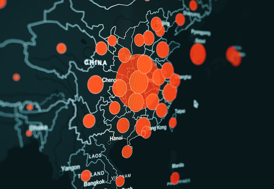
One of the highlights of the course was learning how to visualize different data types, including traditional tabular data, network data, and geographic data. This gave me a well-rounded understanding of the various types of data that I might encounter in my career, and how to effectively communicate the insights contained within them.
The course was structured in two main sections. The first part focused on the fundamentals of effective and ethical visualization and understanding data structure and analysis. The second part provided in-depth training on visualization and communication tools through the use of case studies.
Throughout the course, I gained a greater understanding of how to approach data, extract information, and create effective visualizations to communicate my findings to my audience. I also learned how to develop an interactive visual analytics platform for users to process and present a given dataset.
By the end of the course, I had developed the skills to work in teams and present the output of visualization and visual analytics. Overall, this course was a valuable addition to my data analytics skillset and I feel better equipped to tackle complex data problems and communicate my insights effectively.
The following topics were covered in this course:
Story telling with Data
Data fundamentals
Statistics
Tableau
Visualization
Crosstab
Totals and subtotals
Heatmaps
Sorting
Filtering
Dates
Dashboard
Grouping
Hierarchy
Dual Axis and Combo charts
Combined Axis Chart
Mapping
Calculated fields
Measures
Strings
Dates
Quick table calculations
Graphs
Crosstabs
Ranking
Pie chart
Tree map
Bubble chart and word cloud
Reference Lines
Extracting Data
Relationship between two tables
Joining two tables
Union of two tables
Blending two tables
Histograms
Boxplots
Bar-in-bar chart
Trend lines
Forecasting
Clustering
Pareto Chart
Slope Graph